
Danglesmash
2012, iOS Game
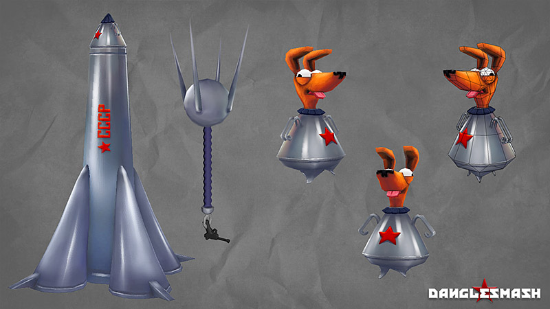
Sputnik Rocket – 972 tris // Space Dog – 582 tris // Sputnik 1 – 424 tris // Sputnik X – 536 tris
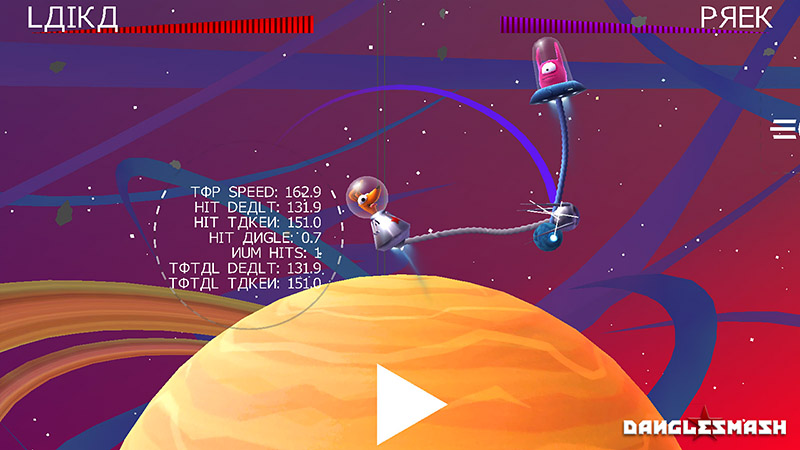
Danglesmash is a turn-by-turn physics-based smash-em-up for iOS made by my long-time collaborator Vegard Myklebust, and the first game project from his animation company/arts collective/urban dance troupe ‘useful slug’.
Whilst the development took place over the course of a few months, I was only able to dip in and out to help in my spare time – handling some of the early look development, concepts and visual design before moving on to building and texturing the 3d assets, painting up the main menus, icons, logos, promo art, as well as creating the audio and sound effects. Vegard handled all the game design and programming as well as the UI designs and layouts, rigging and animation, lighting, effects, and custom shaders.
The original game concept was ‘Conkers in Spaaaaace!’, and we married up Vegard’s love of old Soviet military marching music with my love of pooches to set the game in the early days of the Soviet space program. This informed the overall aesthetic – 1950s B-Movie and sci-fi imagery, old print processes for text and film, Cyrillic fonts, Russian constructivism and graphic design, old science textbooks, and vintage astronomy diagrams.
The initial screen mockups I did were based on making it look like old footage from the 50s – dust and scratches, film grain, as well as heavy vignettes, depth of field, bloom, and chromatic aberration to simulate cheaper, older lenses and aged film. The planets were originally meant to look like cheaply made B-Movie set props and I had fun researching and trying to emulate the palettes of old film stocks, like Kodachrome and early Cinecolor. Font choices were slimline Cyrillic inspired ones, mimicking those used on Soviet posters at the time, which Vegard ended up custom building for the final – swapping in and out aesthetically similar letters to give it an exotic cosmonauty look that was still legible to Latin-script readers.
Whilst the development took place over the course of a few months, I was only able to dip in and out to help in my spare time – handling some of the early look development, concepts and visual design before moving on to building and texturing the 3d assets, painting up the main menus, icons, logos, promo art, as well as creating the audio and sound effects. Vegard handled all the game design and programming as well as the UI designs and layouts, rigging and animation, lighting, effects, and custom shaders.
The designs for our hairy hero evolved through a few very loose and rushed scribbles, at first trying to use the space capsules typical of the early Sputnik program to form the silhouette of the character, and expanding the tiny observation window of the craft to better see the character inside.
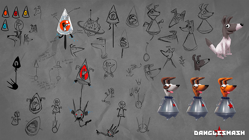
It became clear pretty quickly that it would never read well having the poor dog squashed inside that tiny space on smaller screens, even after trying bright colours inside the capsule to help it draw the eye and mark the silhouettes more clearly. When you want your players to make any kind of emotional connection with their characters, it’s vital to grab as much real estate as possible, especially when you’re working with a tiny screen like the iPhone. You can see these kinds of design decisions in games from the earliest Mario titles to Angry Birds, where heads take up 50% or more of the available sprite space, all helping to maximise cuteness and appeal.
Eventually we had the idea, now enshrined in the intro sequence, that our cosmodog would instead pop his head out of the capsule, tongue wagging, like a dog hanging his head out of a car window. Except in space. This massively increased the potential screen real-estate for the character. It also meant we could do lots more with the facial animation now that the head was so much more readable, all enhancing the emotional appeal of the character.
For the lil pup”s head I spent a while looking for a unique silhouette that read well on tiny screens, was reliant on big clear shapes, and would work with a very limited triangle budget – but still managed to be cute and appealing. In the end I went away from the initial Constructivist inspired angular, stretched designs and went for a squatter, rounded snout with big round features.
The original brown and white textures on the dog didn’t read well at distance, so I switched to a flat single colour that would stand out well on the darker backgrounds. Then, when we massively ramped up the colour saturations, I had to boost accordingly as well, as well as increase the legibility of the little Soviet star, which helped strengthen the colour identity of the character. Although everything shown on the model sheets here are the unlit hand-painted textures I made, without any baking or tricksy stuff, Vegard enhanced the models further with custom shaders, like a colourful rim shader to boost the characters as well as metal and glass shaders for the ships and helmet.

Alien – 260 tris // Ship Base & Canopy – 292 tris
With the alien enemies, I was free to maximise the facial features and ditch any extraneous features (I mean, they’re entirely face – I have no idea how they even fly those ships) and designed them to be able to emote as much as possible within the 260 triangles that they’re made up of. To vary up the visuals throughout the game, initially the ‘conker’ was going to increase in mass as more smashed debris embedded in it, and the alien ships would also grow progressively bigger and more elaborate, working up to ludicrous, planet-sized smash-a-thons. In the end, though, due to the time and budget constraints, we elected to focus what little time I had on creating variations of already existing assets and came up with ‘homages’ of sci-fi and cult characters.
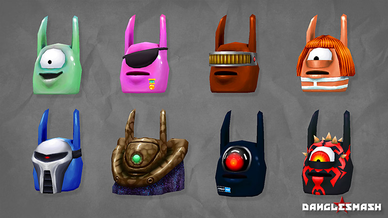
Top Row L-R – 260 tris // 386 tris // 408 tris // 412 tris Bottom Row L-R – 418 tris // 484 tris // 236 tris // 406 tris
We brainstormed a list of characters and I worked through the most varied six to supplement the eye-patched mini-boss ‘rival’ met early in the game. Being able to modularly add geometry or repaint the characters quickly helped add variance without being bogged down in exploring designs or crafting bespoke models for new craft, characters, classes and so on.
It also made it far easier for Vegard to swap in and out assets, as they were always roughly the same polycount, shape, scale, and – most importantly – could re-use the rigs and master animations of the original alien. By riffing on existing characters, we cut down on having to think too long on the designs. Hopefully in future updates we can add in more of these fun nods to our influences, as well as adding those new ships and conker types to further the variation.

Planets – ~600 tris each
I tried a few different painting styles on each planet, to try and push the distinction between each one. Vegard added rim shaders, as with the characters, to fake in a bit of atmospheric haze.
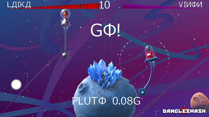
I wish I’d had a little more luck trying to find ‘fun’ things to do with each planet but by the time you reach the outer gas giants (Uranus, I’m looking at your bland ass) it gets increasingly difficult to find notable landmarks. I think we could have gone a lot further with little meteors streaking across the screen, bizarre moons, background animations and weird space junk that all would have helped liven up the stages. Maybe even a giant floating posterior for Uranus that I’d half-jokingly suggested might have been more fun… Sadly all a matter of time and money, as with most things. (We had neither).
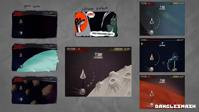
Pluto was far easier to stylise at least, as we still haven’t managed to see it more clearly than 3 or 4 tiny blurred pixels hanging in the void. It’s probably not completely accurate to the real thing but luckily for me we won’t find that out for sure for a few years yet.[/vc_column_text][/vc_column][/vc_row][vc_row][vc_column width=”1/1″][vc_column_text]The background is made up of layers of a 4-colour gradient plane, a layer of nebula swirls made up of geometry, and two layers of differently coloured stars (each one is a 2 triangle facing plane), initally to provide a bit of parallax and colour variation that we never ended up using. We also decided to colour shift the backgrounds using some custom code for each planetary zone to add variation.
The gradient colours on the background and nebula wisps were originally bitmap textures that I’d painted in and these actually caused some noticeable visual glitches and artifacts in-engine, even when only hue-shifted by a tiny amount. I ended up baking the original bitmap colours into the object’s vertex colours so we could then very cleanly shift between hues from the stored values. It’s not something I’d really used before but I’m definitely going to try and use stored vertex information more in future, at the very least for getting butter-smooth bandless gradients.
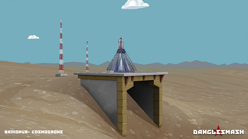
Vegard had intially roughed in most of the models for the Cosmodrome set for the intro – I retopologised a few things and rebuilt others, added in some full 3d clouds and mountains in the distance which again ended up having a negligible effect on helping create any perspective or parallax. Still, it was a fun set to paint up! Vegard again lit and added shaders to the above meshes for the main game.
The main menu layout and base colours had also been roughed in by Vegard early in the project, so I simply added in the heroic dog, painted up the alien vignette, added the logo, some paper texture feel to get that Russian Poster feel and tweaked a few colours here and there. The final in-game version uses more of Vegard’s custom font for the menu items.
As with all mobile game icons, we needed one that would read well on the app store – bold, bright, colourful, and easy to read when tiny. I had some invaluable help from Michael Flareup’s awesome app icon template – using some smart objects, you can paint up your main icon and then quickly see how it looks at all the current iOS resolutions and across the iTunes stores on each device. You can grab it here if ever you need such a handy little tool – http://appicontemplate.com
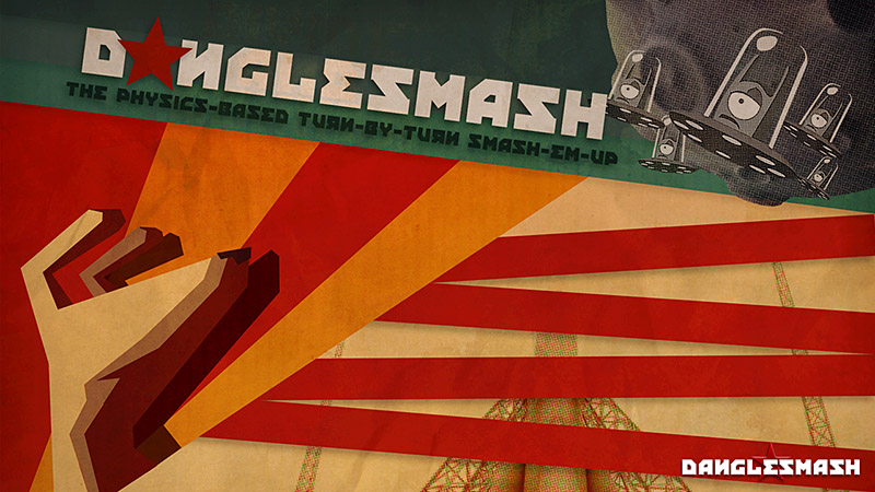
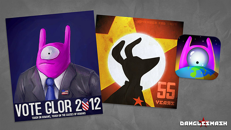
In the closing stages of the project I shifted my focus onto painting some topical promotional artwork, hand-making some promo badges/pins and flyers! I’m hoping to make a few little papercraft figures of the characters as well – anything to help get the game noticed in an overcrowded market!
All in all, just a few weeks work for me and there’s so much more I would have loved to have added had I only more time. But it’s been one of the most fun projects I’ve had – all the more so for being able to support my ol’ pal get his first game made and out on the app store. If you want to try it for yourself (you should!) it’s available at your local iTunes emporium right here: https://itunes.apple.com/us/app/danglesmash/id565080861?ls=1&mt=8[
You can also check out Vegard’s trailer right here and see the game in action!